UX Redesign
Course Shop: Reimagining UBC Registration
Redesigning UBC course registration using a shopping metaphor
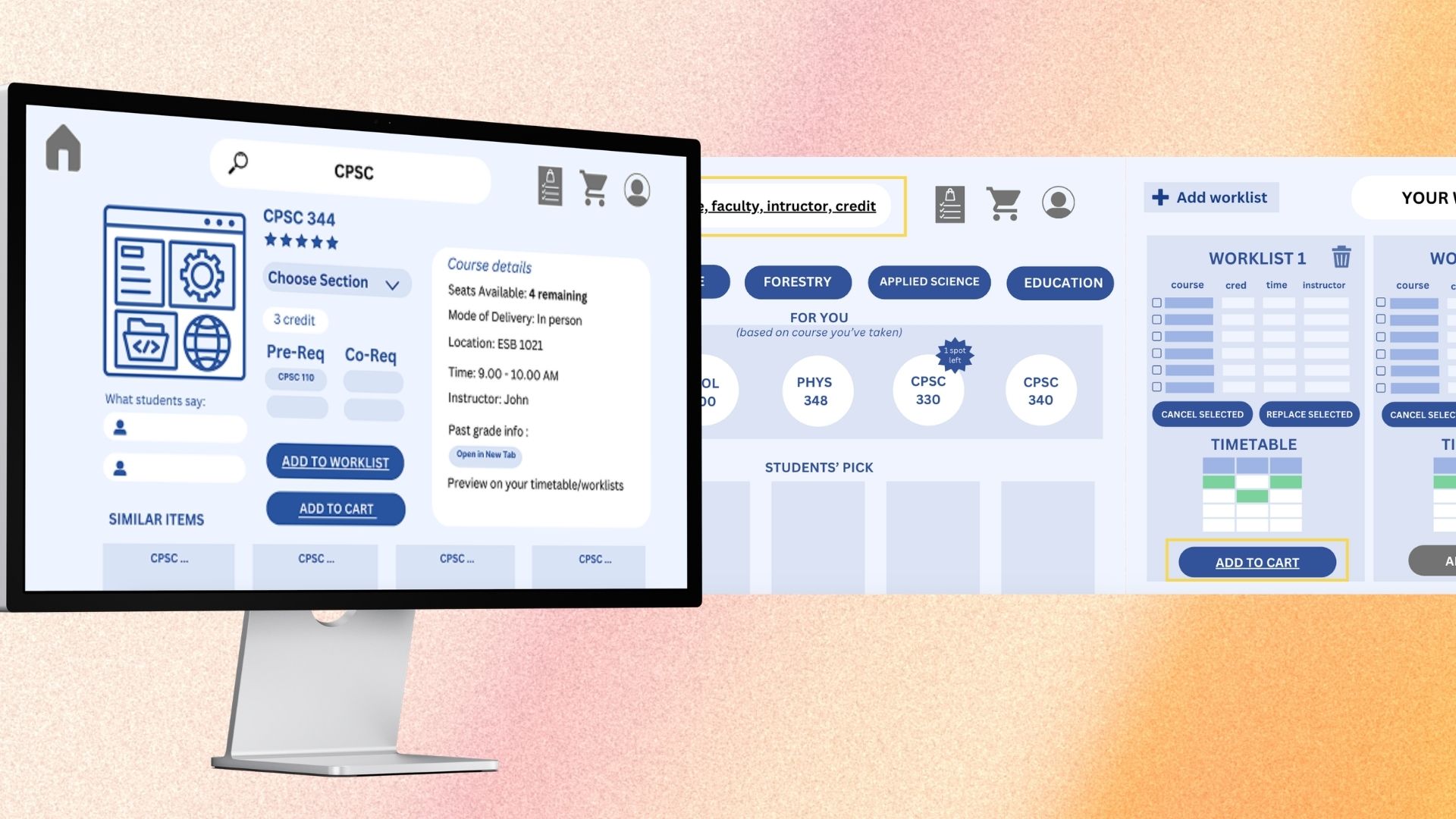
Course Shop reimagines UBC's course registration system as an online shopping experience. Instead of navigating the clunky Student Service Centre, students browse, filter, compare, and add courses to a cart - just like shopping online. Through iterative prototyping from lo-fi sketches to a medium-fidelity Figma prototype, we conducted usability studies with 6 UBC students and achieved a mean satisfaction score of 7.92/10.
UBC's Student Service Centre (SSC) is the primary tool for course registration, but students consistently report frustration with its unintuitive interface. Finding courses that meet degree requirements, comparing sections, and managing worklists involves multiple tabs, unclear navigation, and no way to preview critical information like past grade distributions or instructor reviews.
6
UBC students in usability study
7.92
Mean satisfaction score (out of 10)
8.92
Compare worklist usefulness rating
Needfinding
Needfinding
Interviewed UBC students about their course registration pain points. Identified key frustrations: scattered information, no comparison tools, and unclear prerequisite status.
Conceptual Model
Conceptual Model
Mapped the registration workflow to online shopping: browse catalog, filter by requirements, compare options, add to cart, checkout. This familiar mental model reduced cognitive load.
Lo-fi Prototype
Lo-fi Prototype
Created paper and Canva wireframes of the browse-filter-compare-cart workflow. Tested with peers for initial feedback on layout and flow.
Medium-fi Prototype
Medium-fi Prototype
Built an interactive Figma prototype with detailed course cards, side-by-side comparison tables, prerequisite filters, and a shopping cart for course selection.
Usability Study
Usability Study
Conducted think-aloud sessions with 6 graduating UBC students. Each session lasted 25-35 minutes with 7 structured tasks. Collected error counts, satisfaction ratings, and qualitative feedback.
Analysis & Iteration
Analysis & Iteration
Ran thematic analysis on qualitative data. Identified strengths (intuitive flow, useful comparisons) and areas for improvement (cart vs worklist confusion, missing course descriptions).
We used a think-aloud observation protocol combined with structured interviews. Participants completed 7 tasks spanning the full registration workflow: browsing courses, filtering by requirements, comparing sections, adding to worklist, and registering. We measured both quantitative metrics (error counts per task, satisfaction ratings on a 1-10 scale) and qualitative data through thematic analysis of participant comments.
7.92 / 10
Overall satisfaction
7.92 / 10 (difficulty: 2.08)
Ease of finding courses
7.08 / 10
Feedback understandability
8.92 / 10
Compare worklist usefulness
1.5 per participant
Avg errors (browse/filter)
0.17 per participant
Avg errors (registration)
The shopping metaphor was immediately intuitive - all participants understood the browse-compare-cart workflow without instruction
Prerequisites filter and worklist comparison were the most praised features, consistently rated as 'game-changing' by participants
Users confused 'cart' vs 'worklist' terminology - the dual concept needs clearer labeling and visual distinction
Missing course descriptions frustrated users who wanted to understand course content before adding to worklist
Participants requested: degree navigator integration, timetable calendar syncing, grade distribution graphs, and color customization
Familiar metaphors reduce friction
Mapping a complex academic workflow to the familiar online shopping experience dramatically reduced the learning curve. Users navigated the interface with minimal errors on their first attempt.
Comparison tools are essential
The side-by-side course comparison (rated 8.92/10) was the standout feature. Students currently compare courses by opening multiple browser tabs - a dedicated tool transforms this painful process.
Terminology matters
The 'cart' vs 'worklist' confusion revealed how a single word choice can break an otherwise intuitive mental model. Academic contexts need careful vocabulary mapping.
Iterative prototyping validates early
Moving from lo-fi to medium-fi caught major issues before high-fi development. The lo-fi round revealed navigation problems that were fixed before the Figma prototype.